Agora Design System
Overview
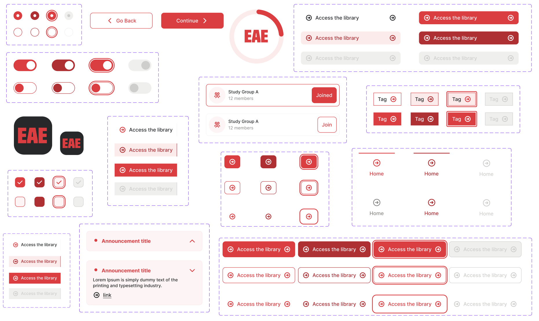
EAE owns several digital products and experiences, including EAE Online, EAE Barcelona, EAE Madrid and EAE Corporate. As these products evolved independently, designers were solving similar problems in different ways. Components looked different, interactions behaved differently, and there were no shared rules defining how the interface should work. I designed Agora from scratch to create a shared foundation for the EAE ecosystem.
Challenge
Before Agora, there was no shared Design System connecting EAE's digital products. Designers were creating their own components and making individual decisions about visual styles, interaction states and component behavior. This created inconsistencies at different levels.

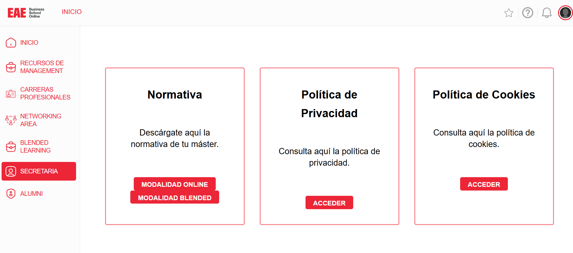
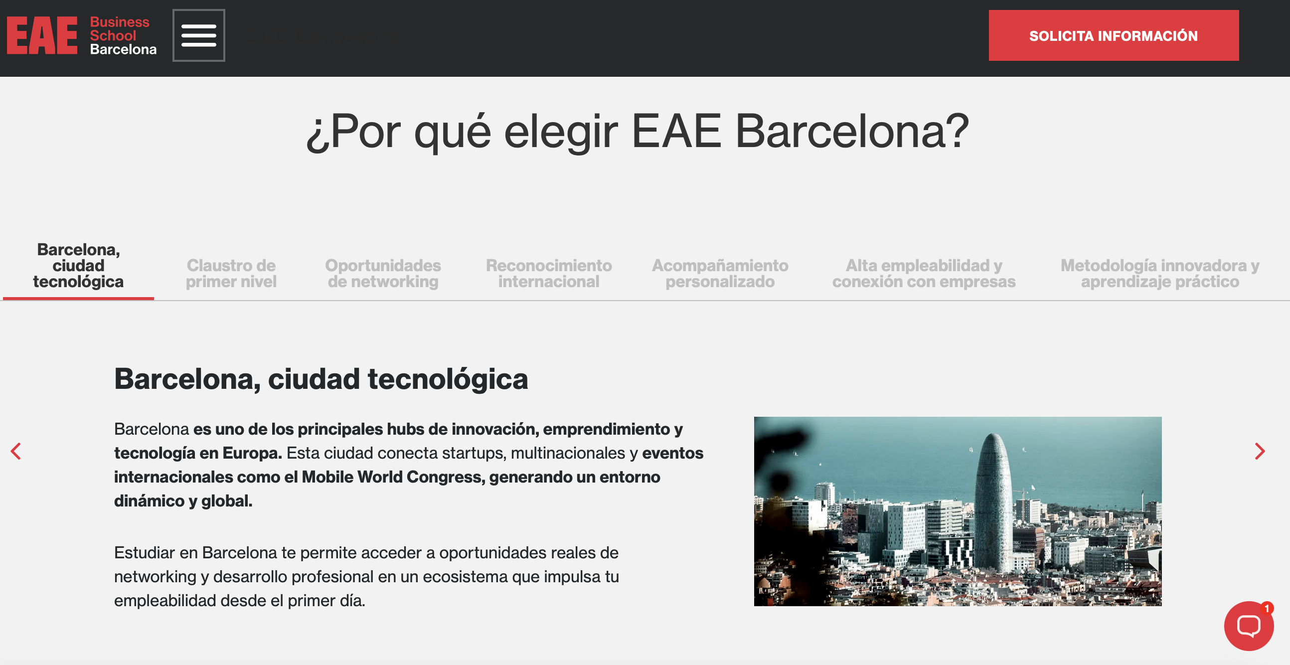
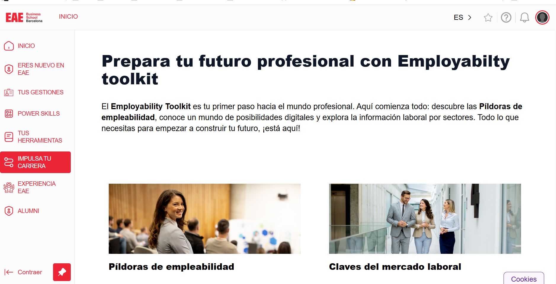
I already had a strong understanding of the EAE product ecosystem, so I used that knowledge as a starting point and complemented it with interviews with different designers. The objective was to identify:
- What problems were repeated across products?
- Which components were being recreated most often?
- Which behaviors needed to become shared standards?
- Which needs were genuinely specific to EAE?
- Where could a shared system create value without restricting product teams?
Foundations
Color
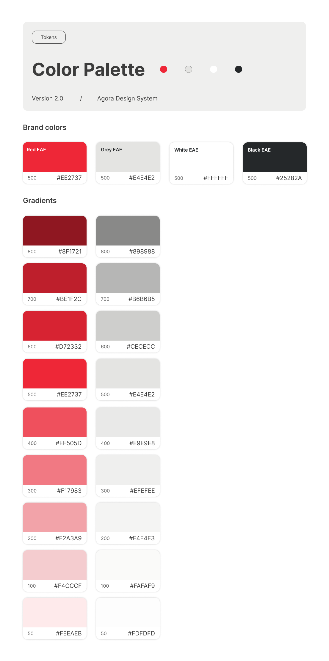
The red palette is central to EAE's visual identity. Rather than treating brand red as the only available red, I created a broader scale so different values can be used for UI states, backgrounds and borders depending on context.
Typography
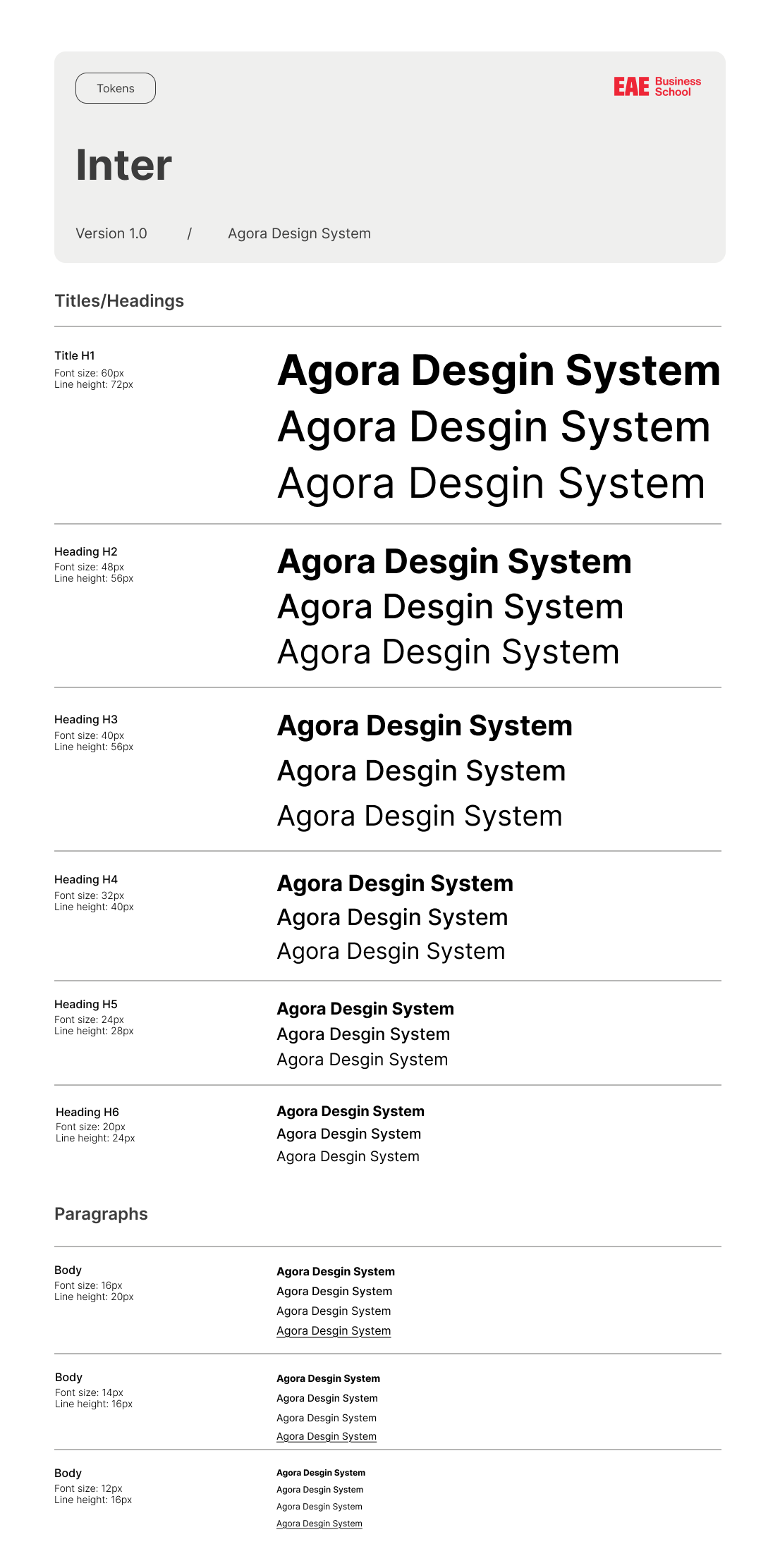
The system uses Inter as its typeface, with a structured hierarchy from H1 to H6 and dedicated body text styles. This creates consistent typographic relationships and sizing across every EAE product.
Icons
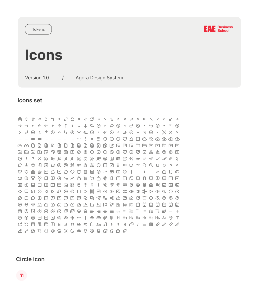
Agora includes a broad icon library organized into categories such as Arrow, Menu, Edit, Environment and Shape, giving designers a consistent visual vocabulary instead of recreating or sourcing icons independently.
Logo
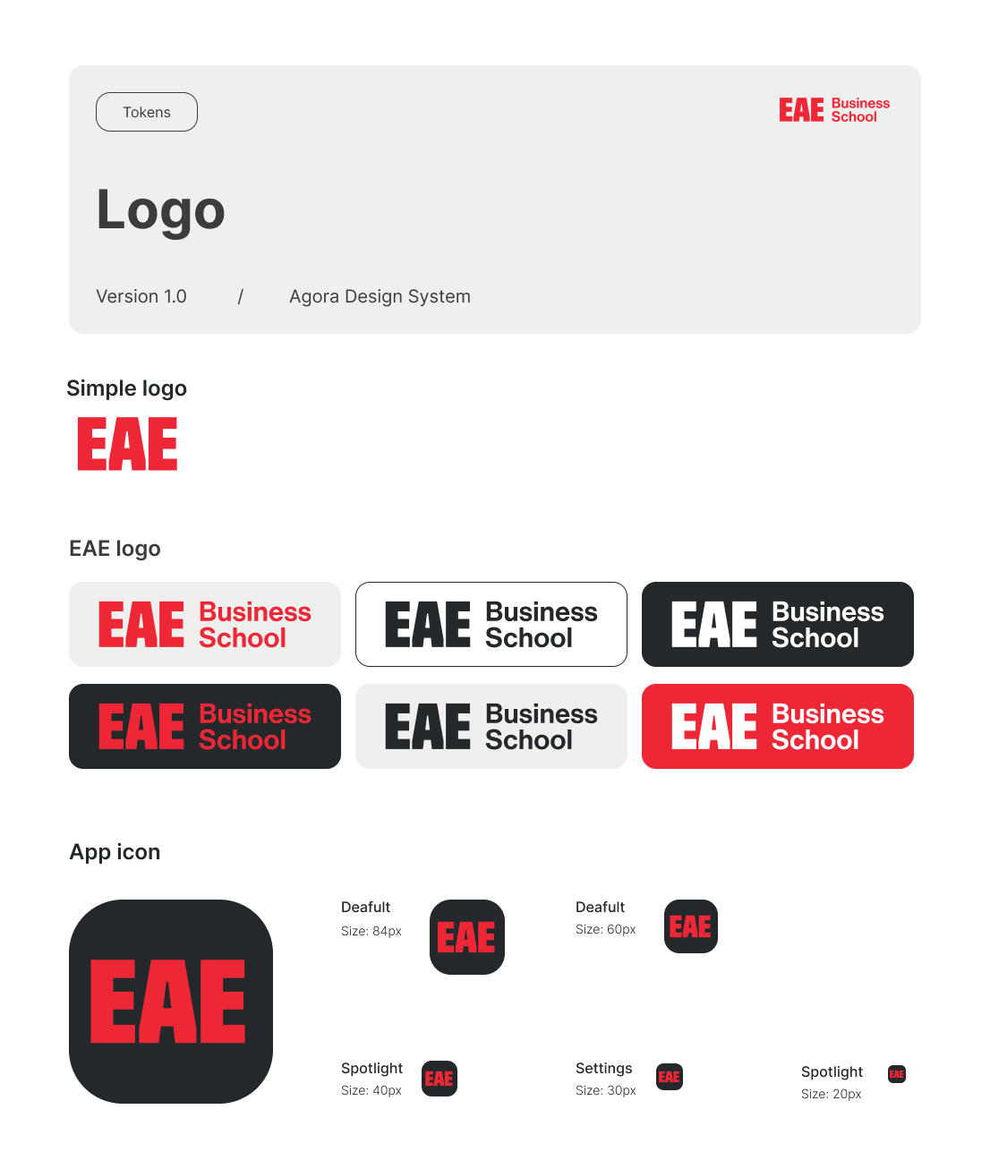
The system includes the full EAE logo ecosystem, covering light, dark, red and other brand variations, ensuring the logo is applied consistently across every product, platform and touchpoint.
Token architecture
Brand
red/100
The underlying brand values.
Alias
primary/25
Contextual meaning (why a value is used).
Mapped
icons/default
Actual component usage (where it's applied).
Components
I prioritized components based on how frequently they appeared across the EAE ecosystem, starting with common building blocks like Button, Field, Menu, Checkbox, Switch, Tab Bar and Avatar, among others. Each one is built with a set of shared properties (Status, Type, Icon Left, Icon Right, Label) so designers can create multiple configurations without needing a separate component for every variation.
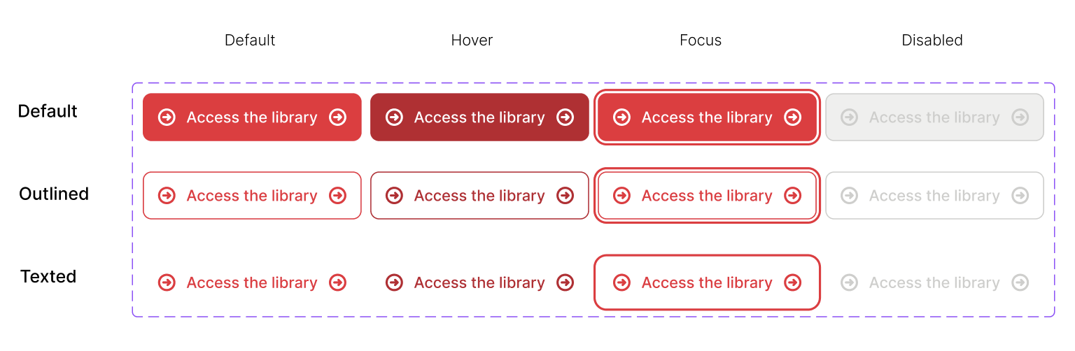
The Button component was one of the areas where the need for standardization was particularly visible. Agora defines a set of button types and interaction states, each treated as part of the system rather than a per-product decision.
Documentation
The Figma library holds the foundations, tokens and components, while Zeroheight documents how and when to use them (purpose, variants, states, do's and don'ts), bridging the visual library with the knowledge needed to use it correctly.
View documentation on ZeroheightOutcomes and learnings
- A shared visual foundation across every EAE product
- A structured token architecture built to scale
- A reusable component library with consistent states and properties
- A foundation for documentation and future development
Learning
Building Agora from scratch, with full ownership of the process, was a turning point: a Design System is not a component library. It's a shared language that shapes how an entire organization designs and grows, together.